Free 404 Page error images and how to make more of those in seconds!
cool 404 images FOR FREE so you can use them all on your website without any fee or even credits

At some point, every growing online business needs a nice 404 Error message page on their website. Most of the time some generic page is created automatically with scripts, such us from Worpdress or other CMS services. Today I will share with you some cool 404 images FOR FREE so you can use them all on your website without any fee or even credits.
You will also learn how you can easily make similar 404 pages using AI Image Generator PRO from deep-image.ai. It will be super fast and simple, so bare with me. I will also provide a link to my task so you can edit it, with your preset or prompt and have fun with it. But first, lets establish:
What ingredients make perfect 404 page?
- Clear Error Message: The page should clearly communicate that the user has encountered a 404 error, indicating that the requested page could not be found. This helps users understand what's happening and why they're seeing the error page.
- Apology and Empathy: Express empathy and apologize for the inconvenience the user has experienced. This helps to humanize the error message and demonstrates that you value the user's experience on your website.
- Navigation Options: Provide clear and prominent navigation options to help users navigate back to your website's main content. This could include links to the homepage, relevant categories, popular pages, or a site search function. Make sure these options are easily accessible and intuitive to use.
- Visuals: Use engaging visuals, such as illustrations, graphics, or even animations, to make the 404 page more visually appealing and interesting. This can help to alleviate frustration and keep users engaged while they try to find their way back to the main content.
- Branding: Maintain consistency with your website's branding, including colors, fonts, logos, and tone of voice. This helps to reinforce your brand identity and ensures that users recognize they're still within your website's domain, even when encountering an error page.
- Helpful Information: Offer helpful information or resources that may assist users in finding what they're looking for. This could include links to relevant FAQs, contact information for customer support, or instructions on how to report the broken link or error.
- Humor (Optional): Adding a touch of humor or creativity to the 404 page can help to lighten the mood and turn a negative experience into a positive one. However, be mindful of your audience and brand tone, and ensure that any humor used is appropriate and inoffensive.
- Technical Details (Optional): Include technical details such as the URL the user attempted to access, the date and time of the error, and a brief explanation of what may have caused the error. This can be helpful for users who want to report the issue or for website administrators troubleshooting errors.
Overall, a good 404 page should aim to provide a positive and helpful experience for users who encounter errors while browsing your website. By incorporating these elements, you can ensure that users are guided back to your website's main content smoothly and efficiently, even in the event of a page not found error.
Free 404 Page images:
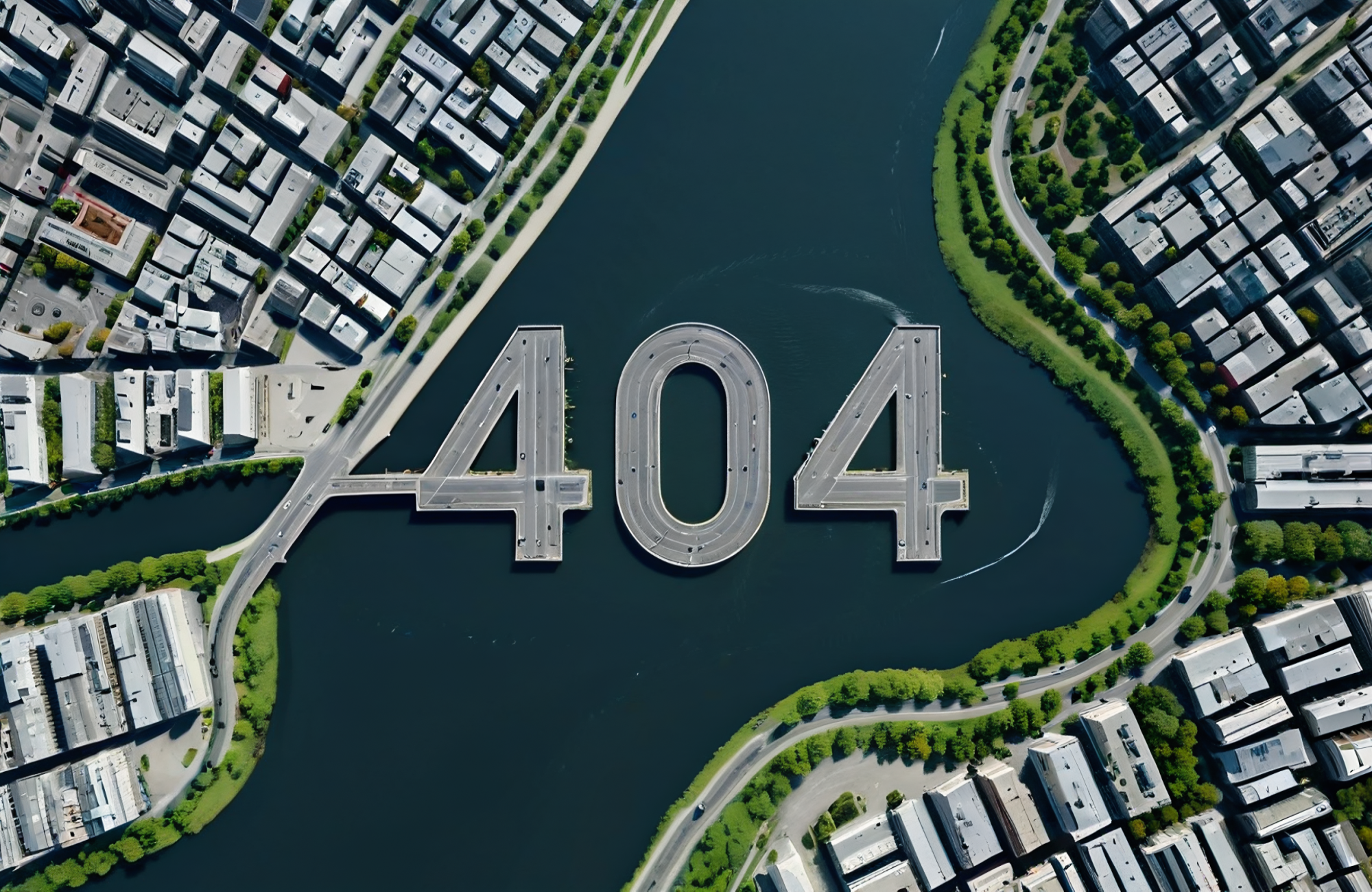
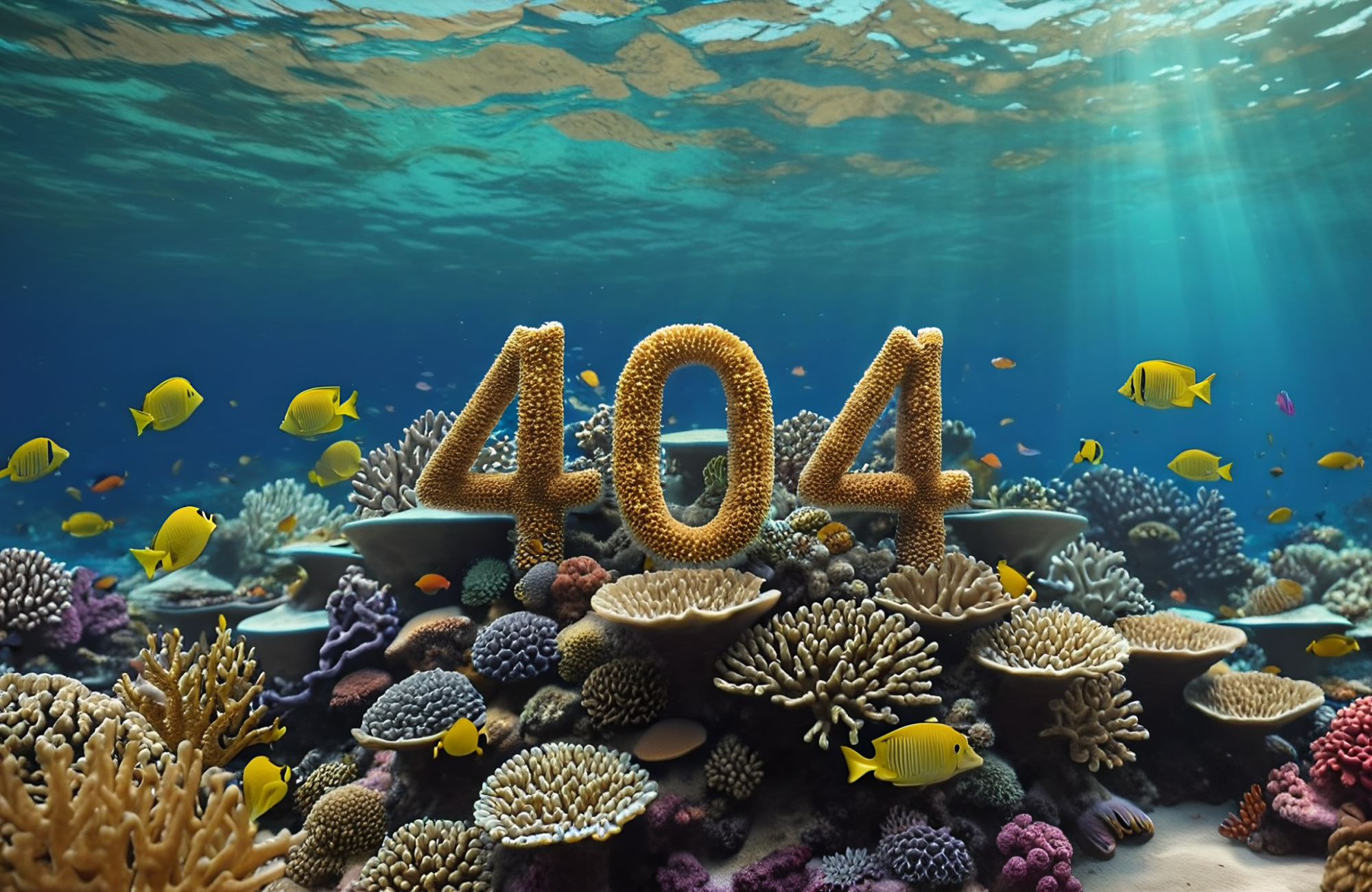
Below you will find a bunch of free for commercial use illustrations that can be used as an image to make your 404 site more attractive and make a better impression on a visitor.






















How can I make those myself?
In order to create images like the above, I used our AI Generator PRO and used a simple image as my base:

Once I prepared an image like that. I went to our Generator:
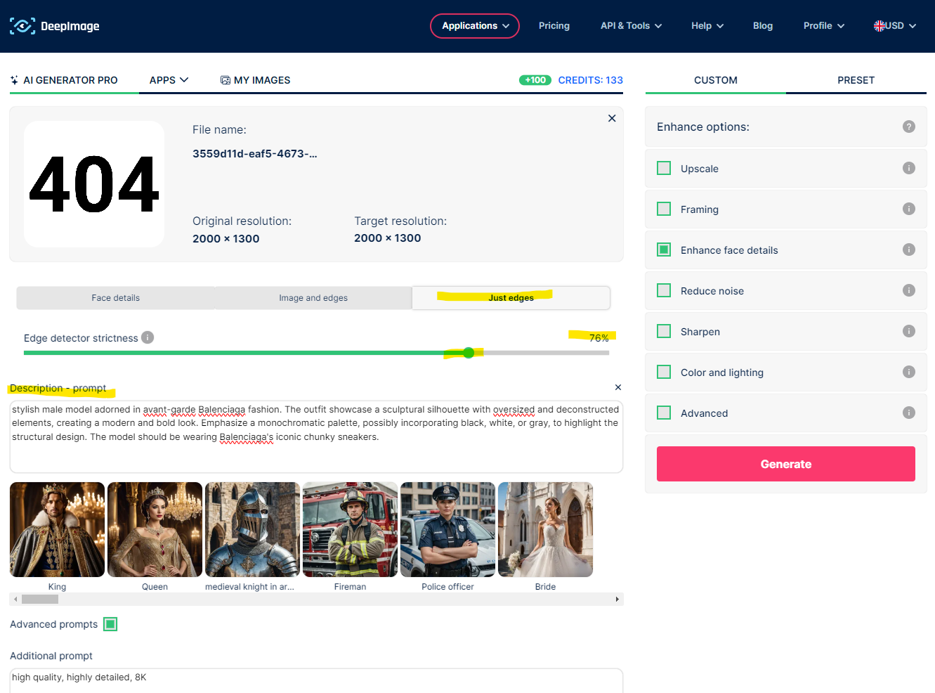
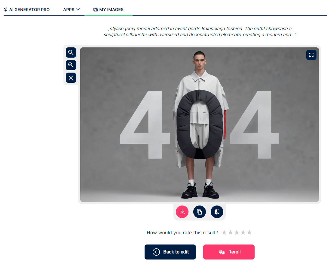
Uploaded prepared image. Selected "Just edges" and the control slider set at about 75%, but you should experiment with the slider between 50% up to 95% to see what kind of various results you might get. For prompt I actually used some existing presets from Avatars, in this case it's Balenciaga inspired model. Have a look at this task template, and if you click "Back to edit" there, you will be able to view exact configuration with all the settings just like I had in my example. Now you can simply switch the prompt for something else, click "Generate" and get unique illustration that will exist only on your website and nowhere else.
Why it's cool to have unique 404 page?
Simply put, there is so much generic content all over the internet, that we have became completely numb to it. With relatively little effort, you can deliver high quality, unique and fresh content to entertain your visitors and to change a fail, visiting a page, that does not exist, into a slightly more positive experience that might end up with conversion or positive buzz on social media platforms.

